The expression "to be on the same page" is often used to imply that individuals are working toward a common goal. Although the application of the phrase may have moved beyond its original context, it is interesting to observe that the image is still valid today, with "the same page" being more than just a metaphor. Modern day meeting rooms are still typically focused on one physical "page," be it a whiteboard, a flip chart or a projector screen.
It is only by looking at the same data that a group can reach a common interpretation and conclusion. But the consensus established is only as valuable as the accuracy of the data on which it is based. The collection of data for use in presentation materials in a process plant is still a manual process, and the data available in a meeting is limited to that which has been collected beforehand. This can, for example, make it difficult to "drill down" to a particular detail when identifying a root cause. The data is, furthermore, often out of date by the time it is presented in the meeting and can even be incorrect due to human processing errors. This leads to misunderstandings, incorrect assumptions and inaccurate planning.
The managers of a process plant typically meet on a regular basis to discuss the challenges and actions that lie ahead. Topics discussed can, for example, involve reactions to developments in areas such as order backlogs, availability of raw materials and equipment downtime. Operators and other staff similarly meet on a (typically) daily basis to discuss the work ahead (usually at the beginning of every shift). The data and trends presented and discussed at meetings may be extracted from different sources including inventory management systems, process data, staff reports, developments in the costs of energy and materials, decisions from higher management and possibly more general information such as weather forecasts. To be usable, this data must be compiled and presented. This process requires many manual steps and has potential for errors. The manual process also introduces a certain latency, meaning that the data under scrutiny may no longer be as up-to-date as it should be.
From basic control theory, it is known that for the system to be responsive, loops need to feed back data in as timely a manner as possible. Of course, latency is far more critical in the inner control loop of a critical process controller than it is in a higher level management meeting, but the underlying principle is the same.
Scrutinizing real dynamic data brings the meeting participants closer to the real process. More importantly, the automatic collection means much more detailed lower level data is accessible, permitting the immediate analysis of underlying causes.

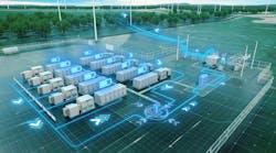
5 The tool ensures the availability of accurate and up-to-date information in plant meetings.
From concept to reality
In cooperation with the Interactive Institute of Umeå (Sweden) and sponsored by ProcessIT Innovations, ABB has developed a proof of concept, now installed in the Obbola (Sweden) plant of the pulp and paper company, SCA. The installation is basically a meeting room display ➔ 5, replacing the conventional projector screen, whiteboard or flip chart, and relieving humans of the need to manually collect data. But, much more than that, the display is a highly intuitive interface and window into the plant, representing the fusion of an enterprise management system with tactile smart-phone technology.

1 Overview showing a 3-D image of the plant.
The system can interface with numerous data sources, including real-time process data streams, both from ABB's Extended Automation System 800xA and from third-party sources such as accounting and inventory software (eg, SAP). There is no reason why the system cannot be adapted to accommodate numerous other data sources, including control systems and their constituent components, from other manufacturers.

2 Zooming in reveals additional data.
The system's functionality is not restricted to the mere collection of data. The display unit is a large touch screen, rather like an oversized tablet. It displays the plant in three dimensions with its key performance indicators (KPIs) ➔ 1. The plant is shown as a 3-D model of the actual buildings and equipment. Using intuitive touch and multitouch functions known from smart phones and tablets, the displayed model can be rotated to bring different elements to the foreground, and can be zoomed into to enlarge details, permitting additional data to be displayed ➔ 2. The viewer can seamlessly move from the plant-level KPIs to lowerlevel KPIs and further down to individual process variables.

3 Zoom down to an extended level of granularity. Decisions can be based on historical data.
KPIs and variables can be displayed in different formats, ranging from simple figures to historic trends ➔ 3. Color coding permits the instant highlighting of values that require attention. A KPI that falls below a defined threshold draws attention to itself by changing from a green to a yellow color coding. A further negative development makes it red. An example of such a trend might be an increase in the volume of waste/rejects, which in turn might be caused by mal-adjustments in the underlying process. The tool makes it easy to intuitively follow the chain of effects from the problematic KPI down to the root cause, which could be in a completely different part of the process. Trending tools help differentiate between random fluctuations and genuinely slipping performance and so help meeting participants decide which issues need to be tackled with the greatest urgency. Besides variables extracted directly from the process, values from other inputs can be displayed in a similar manner. One metric that is important to SCA is staff motivation (which the company monitors on a periodic basis), and which is handled as a KPI and represented on the display.

Further to the live data, meeting participants can add observations to elements in the form of (virtual) sticky notes. These remain attached to the represented elements rather than to a position on the screen and can thus be used for individual annotation. When no longer needed, they can be discarded with a simple and intuitive flick of the finger. Similarly, the screen can be used for handwritten notes and sketches in the style of a whiteboard or flipchart, supporting the decision-making process of the meeting ➔ 4.
User experience has been the guiding light during the development of the proof of concept. The implementation of every feature has been strictly balanced to ensure that functionality does not forego ease-of-use or the satisfaction of using the application.
Hence, by means of user-study methods that are in line with user-centered design methodology, the researchers have shown that the concept is intuitive and provides an appealing user interface.
The implementation
The current installation at Obbola was built with recent development technologies from the game industry, a sector with vast expertise in 3-D technologies. It is the task of the development team to explore efficient technologies from other domains for future use in product development. In the ABB research lab, the researchers are currently working on the next version, which will run on the Apple iPad (➔ title picture).
The 3-D production status and collaboration platform is currently not productized. It is intended only as a proof of concept at this stage. An important benefit of such development is that it permits the exploration of both the strengths and weaknesses of the concept. This creates a better understanding that will be of value in the future product development phase.
The tool is a useful addition to System 800xA, bringing the integration functionality already available at the operator workplace level to the collaboration and management levels and permitting other data sources such as SAP to be similarly integrated. There is, however, no reason why it should not also be made available for other control systems or also integrate further sources of information.
Empowered by accurate and timely data and the ability to expose correlations and causations, this tool is bringing meeting participants closer to the process and is helping them make the right decisions ➔ 5.
Martin Olausson
Magnus Larsson
Fredrik Alfredsson
ABB Corporate Research
Västerås, Sweden
[email protected]
[email protected]